
Over the past few months I've been preparing for the launch of our fall collection (launching in September). The creative process of pulling colour palettes to evoke feeling and tell a story behind each collection is the best part of my job. To me, colour is the single most important element when sourcing inspiration for a new collection. To bring my vision for the fall collection to life, I called upon three primary palettes. Some colours are bold, some are more subtle, but mixed together each palette lends itself to the cozy feeling of fall.
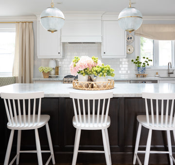
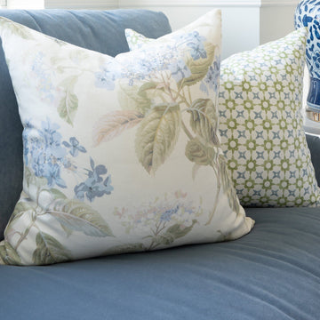
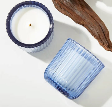
Favourite Fall Pieces
Fall Colour Palettes
Palette One: Ivy League
Deep hunter green, rich navy and wheat will alway be a favourite of mine. This traditional colour palette flows throughout all seasons, but richer hues in the fall make this scheme pop in the cooler months.
Ivy League Inspo.
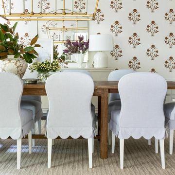
Palette Two: Water & Wine
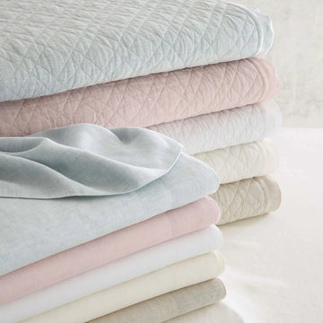
That deep purple gets me in the fall every time! There's something about mixing this rich colour in with lighter tones that makes for a boho palette. Here we see that dark plum/burgundy colour coming through, paired with a nude blush, or light blue makes for a feminine seasonal palette.
The upcoming fall collection is inspired by cozy nights at home, the tradition of homecoming games, Nancy Meyers movies, ivy-clad walls and candle lit dinner parties...
— Andrea Doxey
Water & Wine Inspo.
Palette 3: The Coach House
Not a fan of jumping into fall colours with both feet? No problem. Sophisticated black mixed with an earthy green and ivory is just the right amount of seasonal appeal without going overboard. This palette mixed with a rich chestnut leather and/or antique brass is decidedly "fall" without ever committing to traditional fall red/rust colours.