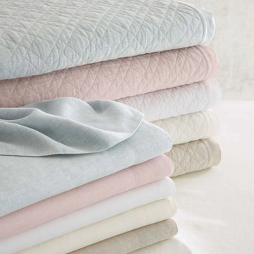
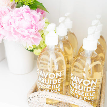
When you're in your thirties and describe your design style as traditional, people often look at you like you are an old lady trapped in the wrong body. When I get these odd looks after describing my aesthetic, I realize that often people think of traditional design as fussy, colourless and ornate. What I call fresh traditional design couldn't be further from that - it's colourful, relaxed and thoughtfully mixes in contemporary pieces. I remember friends coming over to an old apartment of mine saying, "it feels like a real home in here" - to me, that is traditional design. Kate Spade said it best, "classic design is something that can be just as relevant today as 20 years ago or 20 years from now." The challenge in traditional design is making it feel fresh without being too trendy - so below I've highlighted some things you can do to elevate your traditional design style with a fresh and modern feel.
Tip 1: Mix in Modern Elements
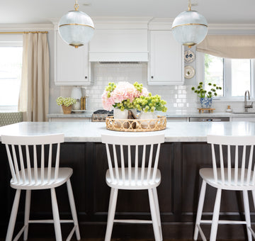
Just because you like traditional, does not mean you cannot use modern elements. In fact, I find that when contemporary shapes and materials are mixed in, it often helps to lighten things up. For example, Jean Stoffer, the designer behind the stunning kitchen below, has executed on fresh traditional design perfectly in this 1902 Victorian home. She did this by mixing in contemporary shaped stools, brass accents and a fun geometric backsplash, while opting for a traditional shaker cabinet, tray ceiling and classic hardware.
Tip #2: Add Contemporary Artwork
The juxtaposition between modern art and a traditional space is another great way to introduce an unexpected and fresh element to a classic design. The abstract art print in Sarah Bartholomew's Nashville home below helps balance the traditional arm chairs and antique dresser.
Tip #3: Mix in Painted and Natural Wood Pieces
Okay, here comes controversy -- PAINT THE WOOD! I'm not saying paint everything, maybe not that super special antique piece that was handed down through the generations, but just because it's wood, it doesn't mean it has to stay in it's natural state forever. Too much natural wood looks heavy and downright dated, so please, don't be afraid to paint the wood. I love the way painted and natural wood looks together - below, the wood console table in combination with the painted tray ceiling and mantel is perfect in my eyes.
Tip #4: Mix Up Materials
Mixing materials and textures is a good way to add visual interest to any space. I recommend this for all your rooms so that the space does not look flat. The bathroom below thoughtfully combines wallpaper, silver and gold accents, linen shades on the scones and a rattan stool.
Tip #5: Add Colour
Now I realize that white is an extremely popular design choice right now. I, a self-proclaimed colour lover, even recently repainted our living room from fresh green to white. In my opinion, a white room requires more thought with respect to furniture, art and choice of accessories so that the room feels cozy, and not sterile. I love the feeling when the walls are painted with colour - it's instantly feels decorated, and doesn't require as many colourful accents to bring the space to life.
Tip #6: Add a Mix of Modern and Traditional Accessories
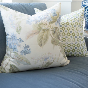
Accessorizing with both classic and modern items is the easiest way to achieve fresh traditional design. The Rainsford Company collection is a reflection of this design style. Some of my favourite pieces are: baskets, ginger jars, trays, pillows and the list goes on! Don't be afraid to mix up your decor, as the famous designer, Bunny Williams says, "If you love it, it will work, that's the only real rule."
